Women in Modern Design: Network Analysis of MoMA Exhibitions, 1950-2013
INFO-658 Information Visualization
Project TYPE
Individual Work
Learning outcome
Digital Technology & Tools
Role
Researcher & data visualization designer
KEY TASK
Network dataset design & relational data modeling (Python, OpenRefine)
Interactive visualization development & iterative design (Sigma.js, Tableau Public)
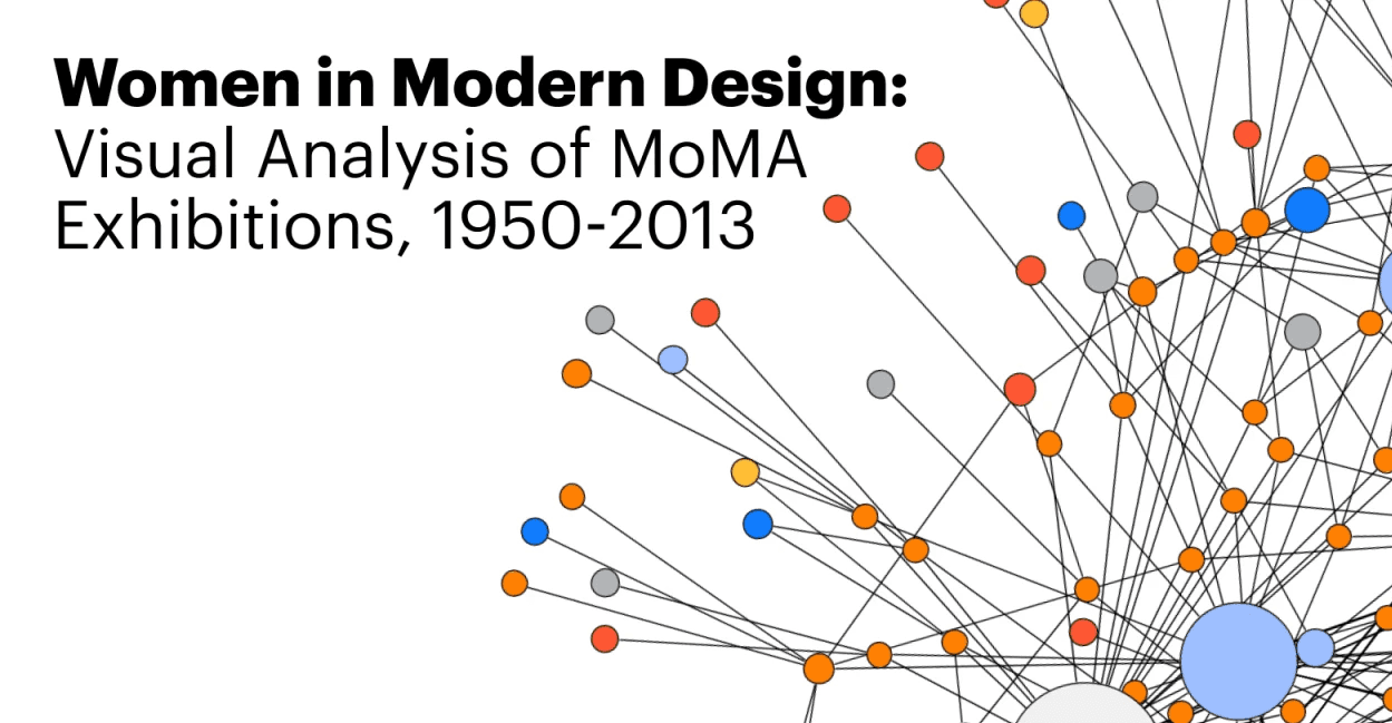
Opening slide for museum of the american revolution strategic planning as the final project submission. may 2024. Still Image. Original image from author's work.
Project Overview
A network analysis examining how MoMA's institutional recognition of women designers evolved across three exhibitions spanning 60 years. Using relational data to surface patterns of inclusion, exclusion, and the connective roles women played in modernist design that traditional design history narratives.
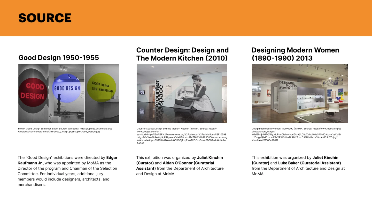
The dataset spans from three MoMA exhibitions: Good Design (1950–1955), Counter Space (2010), and Designing Modern Women (2013), compiled from exhibition catalogs from the MoMA archives, Wikipedia, and Vitra Design Museum records. I built an interactive network visualization with supporting dashboards. and I iterated through structured peer review using a 2x2 effort/return matrix.
Audience: design historians, museum studies researchers, and cultural heritage professionals examining gender equity in institutional collection representation
Methods
Checklists across three exhibitions; I clean and structure the data with Python, OpenRefine, and Claude AI to assist with data extraction and coding; cross-referenced designer biographies through MoMA Collection, Wikipedia, and Vitra Design Museum
Dataset Construction. Built structured edge and node CSV files mapping six relationship types: designer-to-designer, designer-to-country, designer-to-exhibition, designer-to-manufacturer, designer-to-movement, and designer-to-school
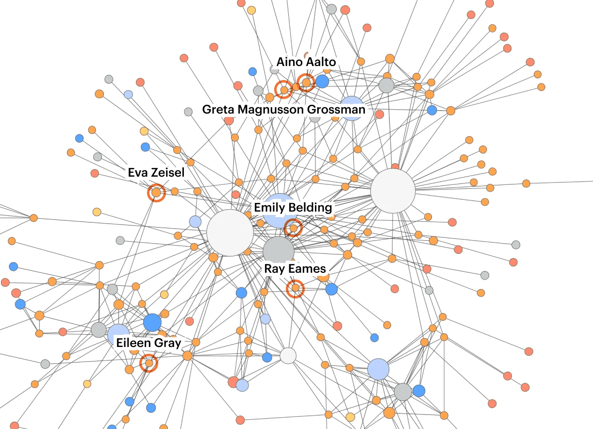
Network Visualization. I developed an interactive network visualization in Sigma.js, applied betweenness centrality measures to identify women designers functioning as bridges across design communities.
Supporting Dashboard Design: I built a Tableau dashboard to visualize the geographic distribution, movement connections, and the evolution of exhibition representation from 13% to 100% women across the three exhibitions.
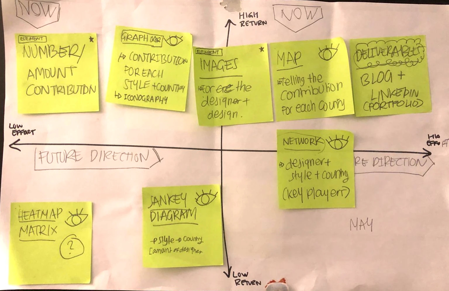
Peer Review & Iteration. Refined visualization priorities through a matrix-based effort/return peer review process; incorporated Professor Chris Alen Sula's feedback to narrow focus from a broad mid-century survey to women's representation specifically
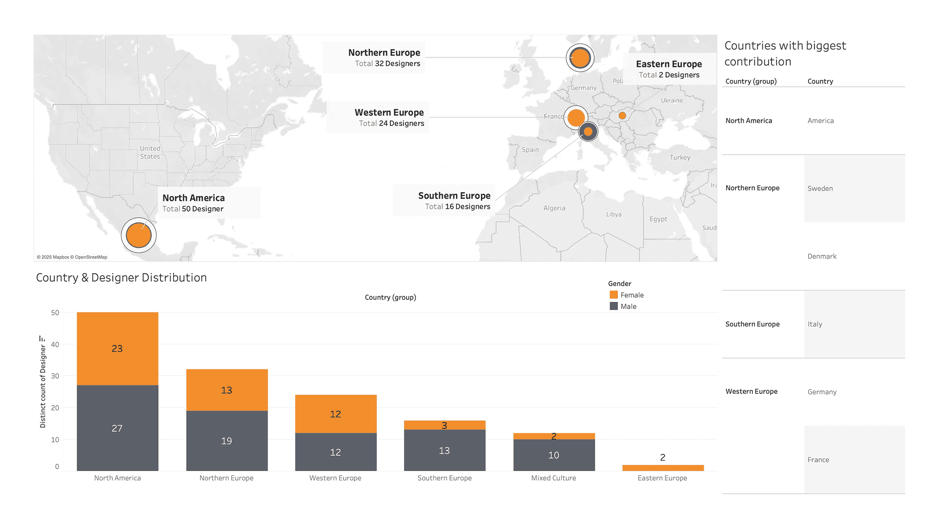
tableau dashboard showing the designer distribution. may 2024. Still Image. Source from author's tableau work.
Rationale 1#
Digital Technology & Tools
This project required me to make interpretive decisions at every stage of the data pipeline: from defining which relationship types to model, to deciding what counts as a connection between a designer and a movement. Building the edge and node CSV files across six relationship categories meant I needed to structure relational data and curate reasoning based on the available research using the Wikipedia API. The network visualization in Sigma.js and Tableau dashboards pushed me to work across different tools and codebases, each with different ways of simplifying the data that needed to be named rather than hidden.
For more in-depth research, methodology, please learn more by clicking the button below
LEARN MORE