Data Visualization

Catalog to Dashboard
Interactive Dashboard for Collection Metadata Exploration
Key Results
Reducing time-to-insight by 94%
6 Interactive visualization
Key players and regions discovery
Role & Timeline
Data Analyst
Fall 2024 (14 weeks)
Scope: 2 .csv files with total +1000 rows across five years
Approach
Exploratory Data Analysis
Tableau (Visualization & Dashboard)
Year-to-year analysis
Filtering system
The Challenge
I supported a research project studying MoMA’s Good Design exhibition (1950–1955). Their goal was to understand who shaped this era and how power was distributed among designers, using a dataset derived from the original exhibition catalog. To do this, we worked with two main datasets:
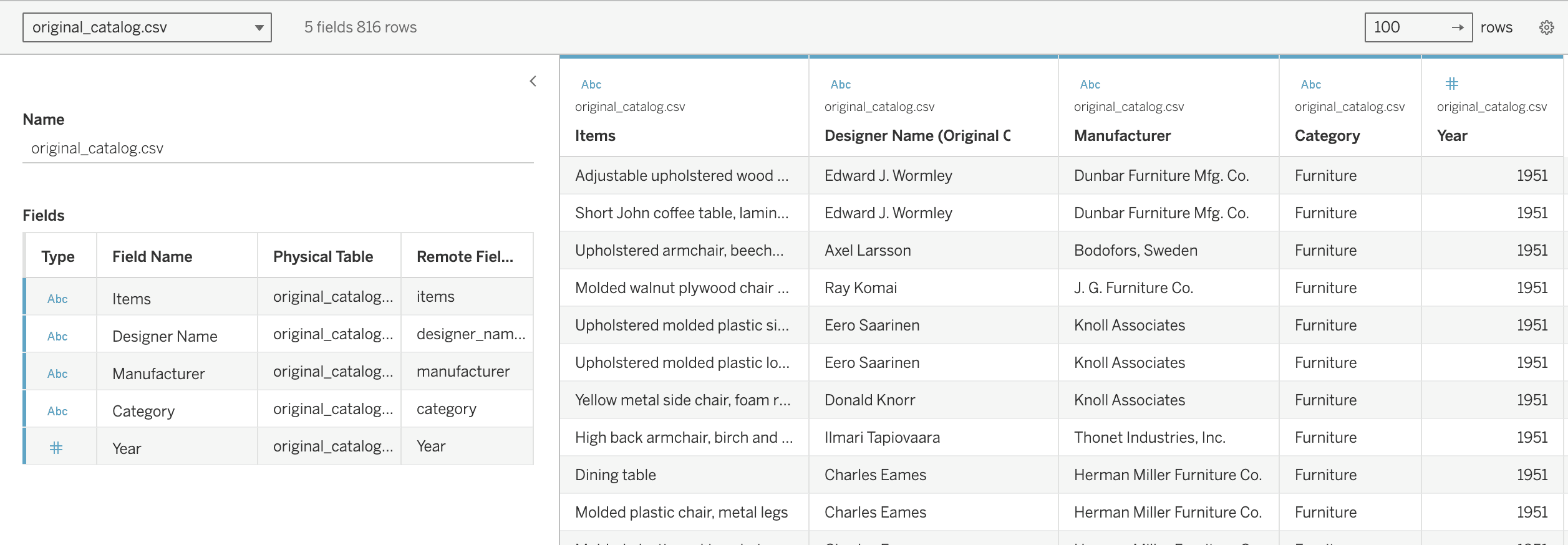
Original_catalog.csv contains OCR‑scanned data from the exhibition catalog. The entities include Item, Designer Name, Manufacturer, Category, and Year: 5 fields and 816 rows in total.
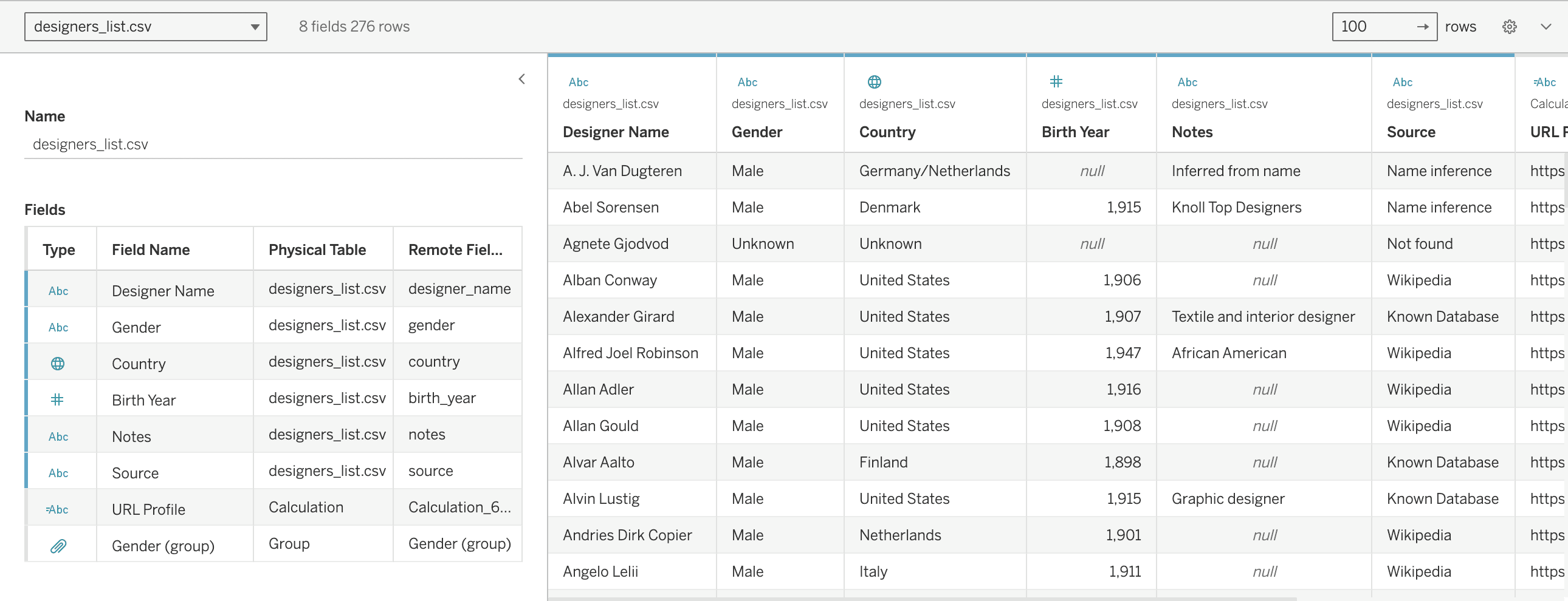
designer_list.csv is an enriched dataset created using the Wikipedia API and semi‑manual research. The entities include Designer Name, Gender, Country, Birth Year, Notes, Source, URL Profile, and Gender: 8 fields and 276 rows. There are many null values due to incomplete information on Wikipedia.
The researchers then formulated key questions to identify patterns in these datasets and better understand the main patterns and show held visibility and influence within Good Design. The archive's five PDF exhibition catalogs required 3-5 hours manual reading per research question.
Explore the Key Questions below
Discovery
Interactive EDA Dashboard as Research Tool
Explorative Data Analysis digests for quick analysis
Consolidating 5 years into a single interactive view, enabling pattern discovery through filtering with Tableau. Six visualization types: Timeline (year-by-year trends), Category breakdown (furniture vs. textiles), Career trajectories (age patterns), Documentation quality (gap analysis), Geographic distribution, Designer directory (filterable)
Researchers ask questions, dashboard reveals answers in seconds.
🔍 Descriptive Statistics | Calculating distributions, frequencies, completeness metrics (gender by year, category breakdown, documentation gaps) |
|---|---|
📊 Distribution Analysis | Visualizing how variables spread across ranges (designer ages, temporal patterns, nationality representation) |
🔗 Relationship Exploration | Examining variable interactions (Year × Gender, Category × Gender, Geography × Career span). |
Findings
Each finding answered specific research questions through descriptive statistics, distribution analysis, and relationship exploration.
Insight 1#
How do contributions change over time, and do any Group dominate?
Gender Gap Widened to 65% During Celebrations
Distribution Analysis (Temporal) Demonstrates how temporal distribution analysis reveals patterns that aggregate statistics hide, a methodology applicable to any multi-year dataset requiring trend identification.
The peak occurred during the Best of Good Design 1955, when curators selected the most celebrated designs.
Insight 2#
Do patterns differ by region, gender, and category over time?
Career Recognition Patterns Differ by Gender
Relationship Exploration (Multi-dimensional) across three dimensions (age, gender, geography) demonstrates multivariate analysis capability. Reveals systemic differences in recognition versus simple representation counts.
Male designers established young and maintained visibility. Female designers appeared mid-career and were earlier absent from institutional recognition.
Insight 3#
Where are the documentation gaps, and how does that affect interpretation?
Documentation Gaps Reveal Preservation Priorities
Descriptive Statistics (Data Quality) Gap distribution itself is finding: absence reveals institutional priorities. Famous designers are documented comprehensively, while lesser-known figures are left incomplete.
Nearly half of the designers went undocumented for nationality. 1954 spike suggests rushed anniversary production prioritized celebration over thorough documentation.
Mid-century design canonization systematically elevated established male designers through celebrations, recognized women differently across careers, failed to preserve half the contributors' histories.

Researchers ask questions, and the dashboard reveals answers through Exploration.
Project Outcomes
Framework applicable to museum collections, research institutions, cultural heritage datasets. Anywhere historical catalogs need digitization and data interoperability.
EFFICIENCY
95% time reduction
Interactive dashboard replaced manual PDF reading. Researchers filter and patterns in minutes.
DISCOVERY
+3 insights revealed
Temporal analysis uncovered celebration year bias, relationship exploration showed career disparities, descriptive statistics quantified documentation gaps
PRESENTATION
Invited Presentation
Invited by the mentorship program instructor, Dr. Glenda Guerrero to showcase EDA methodology at Saint Peter University's Data Science Institute.
APPLICATION
Informs Priorities
Methodology enables museums to systematically prioritize documentation, then contribute to Wiki Commons & Wikidata— for public knowledge infrastructure.
Reflection & Learning
This is an independent research project for a class, and it was extended to the Data Visualization Mentorship program by the DataViz Society. Open to collaboration with museums, archives, or research institutions.
Data source: Cleaned from publicly available PDF catalogs, enriched via Google API & Wikidata—not MoMA internal records. Further development would benefit from institutional collaboration.
Mid-century design appears to have consistently foregrounded established male designers over time, recognized women’s contributions in more limited or uneven ways across their careers, and failed to preserve complete histories for nearly half of all contributors.
DISCLAIMER
Data Source: The Museum of Modern Art Exhibition Records: 463.19, 494.8, 520.11, 542.4, 570.1. The Museum of Modern Art Archives, New York. Note: Manual data extraction may contain errors and may not fully reflect internal information resources. Personal class project for Data Visualization; additional archival materials not yet consulted. Feedback welcome.

Learn More
Table of Contents